Effective and beautiful medical device design. Ultimate guide for Medtech!
Is technology overriding design when it comes to medical products? Tech can be wrapped in a standard casing and the device is marketable. Or is it not?
Table of Contents
Design guide for Medtech
Along with the development of medical technology and medicine itself, doctors, and patients show more demands. In medical spaces, they want to be surrounded by devices designed to a high standard, just like in everyday life. We pay more attention today to the appearance and functionality of consumer electronics and household appliances at home. We choose our smartphones, cars and even scoots by some details. So shouldn’t medical devices be “beautiful and useful” at the same time?
From my perspective, medical device designs should be adapted to the context in which they are used, the users and the process of use. I’m sure you’ve already noticed the difference between consumer medical devices and ones mostly seen in hospitals. The first thing which comes to my mind related to small Medtech gadgets is the simplicity of the interface, which eliminates the possibility of misuse. Pretty much like consumer electronics. Devices for doctors are built primarily for one purpose: to accelerate working pace, so the final design is more the result of their work observation, medical consultancy rather than personal “feeling”.
Design evolution in Medtech
This time I’d like to focus on smaller, home devices and show design evolution in real-life examples.
Holter ECG
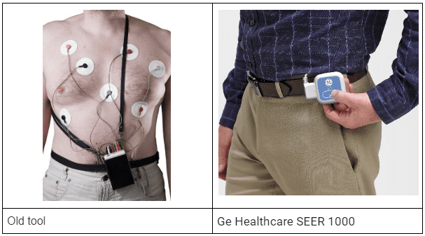
Old:
- heavy
- inconvenient to carry
- looks like a complicated medical device – it can discourage patients from doing the test
- there are buttons under the cover that may be accidentally pressed by the patient
New:
- light
- small device
- easy to put in a pocket, attach to a belt
- minimalistic, rounded form
- uncomplicated interface – one button to control form of allusion to apple ipod shuffle
Both solutions work in the same way, using basically the same technology. But which one would you choose? A patient should actively function with it all day long and perform usual activities which contributes to a more full result of the examination – the examined person is not controlling himself and does not think about the device. That’s why design helps here to make the device as unnoticeable as possible and improve results.
Home medical devices need to meet one more requirement – to encourage individual consumers to buy them. Not only because of the device functionality, but also for the overall product setting and a service associated with it.
Creating a unique brand identity allows you to stand out on a shelf. Even here it is crucial to determine the product target group and buying group. Keep in mind they are not the same. For example, products for children are bought by parents, products for older people are very often bought by their younger family members. Which means – a product must meet design requirements of both groups – the functional requirements of the target group and the image requirements of the buying group.
Another good example is the evolution of cardiotocography. Usually we think about one of these when we hear “cardiotocography”.
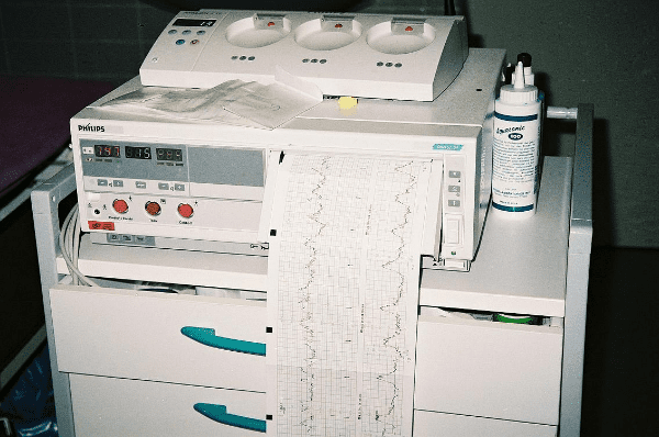
However, even such devices today are not bigger than a mobile phone. A project we worked on is Pregnabit. The challenge was to introduce a medical device and system designed for professional telemedicine pregnancy cardiotocography.
It allows to record CTG recordings anywhere and anytime in a home environment.
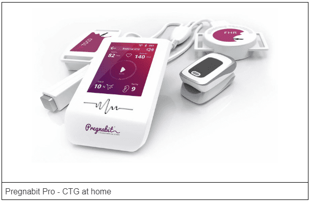
I can point out some specifics:
- consistent color palette in the device and interface, bright colors with colorful accents
- simple, modern form
- small size device
- fitting into the style of pregnancy products – products aimed at women, products evoking positive feelings, round, dominant colors are pink, violet, pastel colors
- simple, modern interface
- the whole creates a coherent set – device, interface, platform, website, packaging
- service including Pregnabit Cloud platform, where the analyzed results are available
What about painkillers we all know pretty well and replace them with a medical device? Is it possible? Tru Plus + is a handheld physiotherapy device which uses a method of transcutaneous nerve stimulation to manage pain.
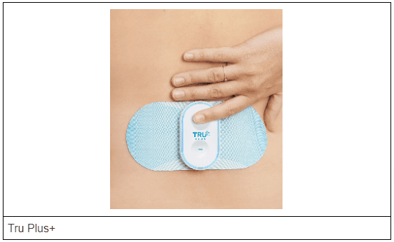
Features:
- simple interface – two large buttons to make therapy easier for older people
- illuminated element around the form – communication with the user, eye-catching, modern detail in the form
- simple, clean form referring to the analgesic pill
- consistent colors of the product
- the product is not associated with a crude, complicated medical apparatus
- comprehensive product design – device, patch, packaging, website
Handy wearable gadgets
A group of products with growing popularity are those that belong to the wearable technology trend where design plays a big role. This includes smartwatches and fitness trackers that provide real-time health information, often connected to an app that collects and analyzes the data.
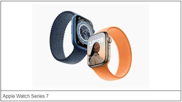
Smartwatches accompany users throughout the day, they are part of the clothing, they must be functional and adapt to the user’s style. They use an element of personalization or, on the contrary, make the devices invisible.
Apple Watch Series 7:
- rounded, simple form
- the possibility of personalization – color, belt pattern
- pleasant materials to touch – they have contact with the skin
This section also includes modern solutions for blood pressure monitors: Withings BPM Connect blood pressure monitor with immediate feedback on the device and full history in the app.
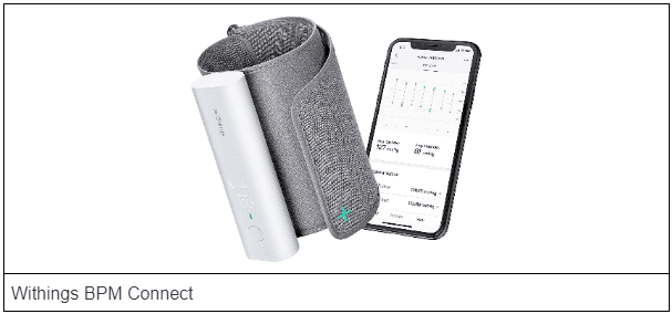
Product description:
- compact device, easy to carry
- simple interface – one button to control: switching on, connecting to wifi and application
- discreet device – we can perform the test in any place without drawing attention to ourselves
- Led display – the first one to provide results, it is also an interesting detail in the form
- modern version of a traditional blood pressure monitor
An interesting group of medical gadgets belonging to wearable technology are home devices for monitoring vital parameters – temperature, breathing, sleep, body position for children.
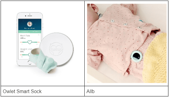
The devices fit the design of products for children:
- round, delicate forms
- shapes that are friendly to the reception of forms, positive associations
- pastel, bright colors
- delicate, pleasant to touch materials – cotton, plush, soft plastic, silicone
- small dimensions
- treated as an element of clothing, so they do not disturb the child
The form of the device should both be comfortable for children and encourage parents to buy it. A well-designed application in which you can check the parameters measured by the device also plays an important role here.
Short summary
A recipe for medical device design can be illustrated by the same principles derived from the 10 design principles of Dieter Rams, which I think are a ultimate guide to work on any new device:
- Good design is based on innovation – introducing new product solutions based on analyzed problems improves the process of research, treatment
- Good design makes the product useful – well designed products affect the comfort of use for doctors, patients and improve the well-being of the examined (physical and psychological comfort)
- Good design makes the product understandable – the form communicates its function, simple interfaces, form follows the process of use
- Good design is unobtrusive – devices are not decorations to be put up, they are meant to fulfill their purpose, to fit the space they are in – office, treatment room, home
- Good design is thorough down to the last detail – taking care of the whole project – materials, form, interface
- Good design is as little design as possible – (less is more) forms without unnecessary accessories, without decorative elements, avoiding strong colors – shades of gray, whites with color accents, pastel colors (products for children)


